Hey Sedy!
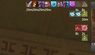
This has been a problem for quite sometime, I can't say for all of us but I know a lot of players find it a tad annoying that ropes are part of the buffs we have. Meaning if one goes in range and out, our buffs always move to the left/right side. Now normally this shouldn't be a problem, but sometimes we do need to cancel out buffs. Things like trans cards, shields and the like. Its really annoying in PvP/PvE when you're running around trying to shield yourself before attacking, but since a rope moved the buff before you cancel it -- you just ended up cancelling 3 buffs and a tarot.
Not cool. LOL
So, we propose to edit the layout on how the buffs will stack in the interface. Though I'm not sure how you can improve on it more (aside from making each of the lines editable and you can customize where to put it, but anyway~) Attaching below what we mean--
This is the current look of our buff interface:

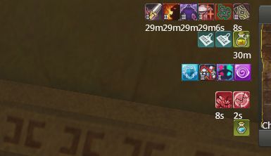
What we would love to happen would be something like this:

Where the ropes have a different category below. They can come and go as freely as they can without affecting our self/target buffs. Also because of needed space, bump down Debuffs and the Server buff.
XD If you could tinker with it Sedy that would be great~ I for one would love a customized version where we can drag each category differently in the screen LOL.
S'all for now!
Cheers!
 4 days ago
 0
0
 125
125


